

Subject: ICT SHSM Certification
Objective: Students will have a crash course on photography with this reference to support their development
SHSM Advanced Training in a Technology - Photography


INTRO
Photography is a broad subject, to suggest that you can master any particular element in less the two-three hours of a SHSM certification would be unreasonable. That said, this certification intends to focus on the barebones of photographic concepts for you to grasp and practice in a straightforward and functional way. Please remember that most of the practices and skills you can develop are considered "perishable skills” which means that if you don’t practice them you will slowly lose your ability - this extends not only to the capture of images, but also things like the use of imagery processing software such as Lightroom and Photoshop which are routinely subject to updates. With that said, get out and shoot/edit as often as you can afford! Let’s get right into it.
COMPOSITION
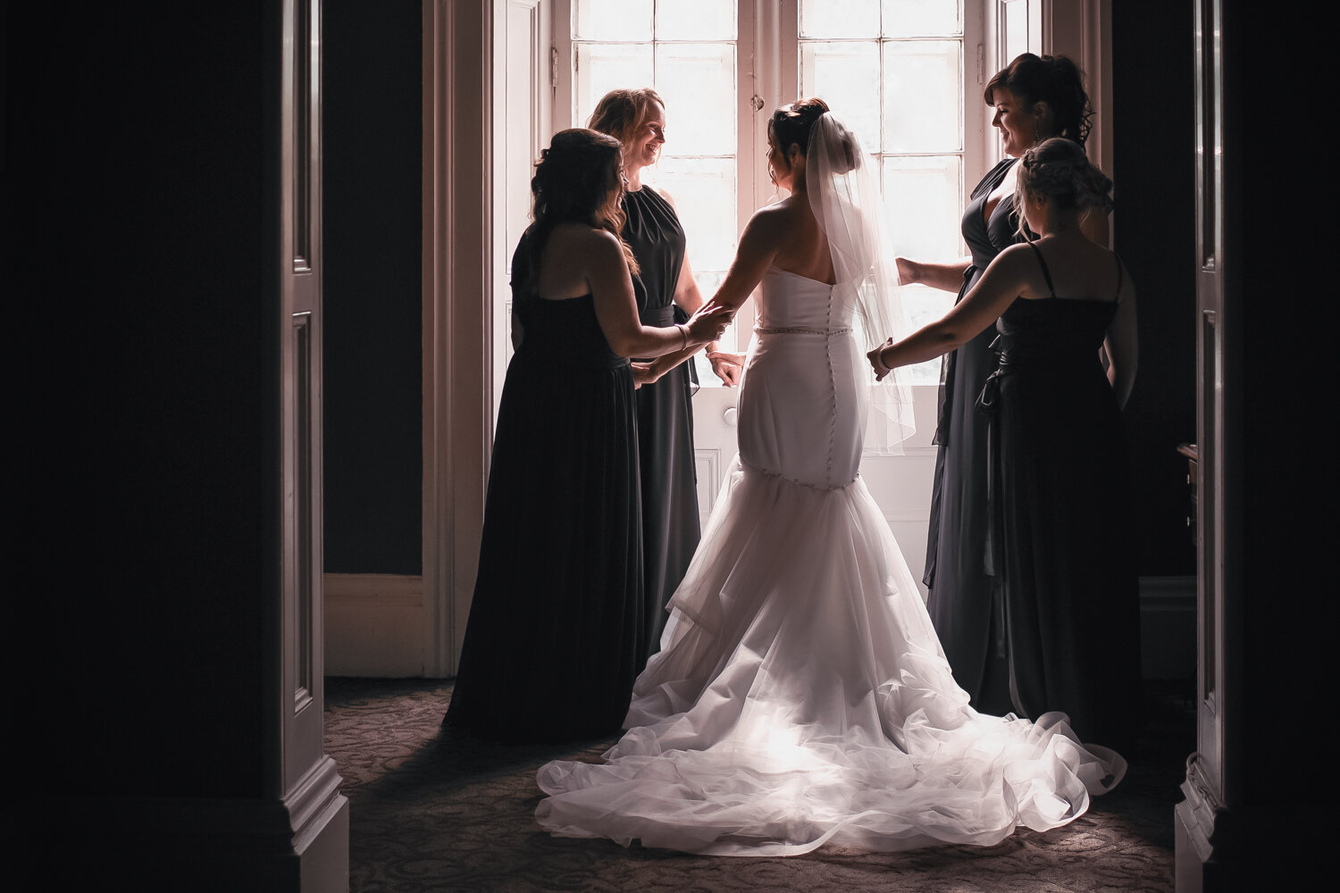
The groom and groomsmen from a destination wedding a number of years back in Jamaica.
If ONE component is the definitive measure of what makes or breaks a photo, it’s composition. Composition refers to how the subjects (elements the viewer is intended to focus upon) are related. This refers to not only their relationship in the frame, but also to one another, with consideration for even their environment. Ultimately composition is concerned with the subject(s) and the environment, their balance, relationship, and the use of the frame. To be clear, images do NOT need to be symmetrical to be pleasing/engaging, but generally they do follow rules. Some rules are constants, for instance the rules pertaining to colour harmonies we’ll explore below; others are a bit more adaptable such as many of the most common compositional rules. Feel free to consider many of the compositional rules as guidelines intended to enable you to find success in leading or retaining your viewer’s attention to key elements such as your subject(s).
If your image is composed effectively, the image should lead the viewer along a pathway, or towards a specific subject, so as to encourage them to connect or contemplate. This can be done through a number of methods, but there are a good number of things to consider, such as if the subject is facing towards the center of the frame or away from it. Let’s explore considerations that a photographer should make when composing an image.
Here are a few rules pertaining to composition:
THE RULE OF THIRDS
LF03-2016-0008-13 - An image I shot of two members of the Canadian Armed Forces firing an 84mm Carl Gustav.
Imagine two horizontal and two vertical lines equally distant over your image dividing the image into 9 equal sized and shaped sections like a Tic-Tac-Toe grid. Your phones will frequently show you an overlay like this to enable you to compose an image in a way that is more aesthetically-pleasing. To make the most of the rule, organize key points of interest either along one of the lines, or at an intersection. Take a look at the photo I shot and how the soldiers are vertically along one line, the weapon and round are along another, as is the explosion launching the round.
LEADING LINES
Leading lines are elements which present as prominent lines through the image. They can be used in a number of creative ways, but generally they either lead to the subject directly or they frame the subject in such a way that the lines direct the viewer’s eye to stay in the frame or head towards the subject indirectly. One thing to note is that the lines themselves do not have to be solid nor do they need to be straight; they can include things like patterns, curved/spiraled lines, or inferred lines as seen in the photo below:
LF2014-0049-22 - Soldiers in dress uniforms on parade atop Parliament Hill in 2014.
See how the collars and belts provide an inferred line which leads towards the soldier in the center? That’s an example of an inferred (as opposed to direct and unbroken) line.
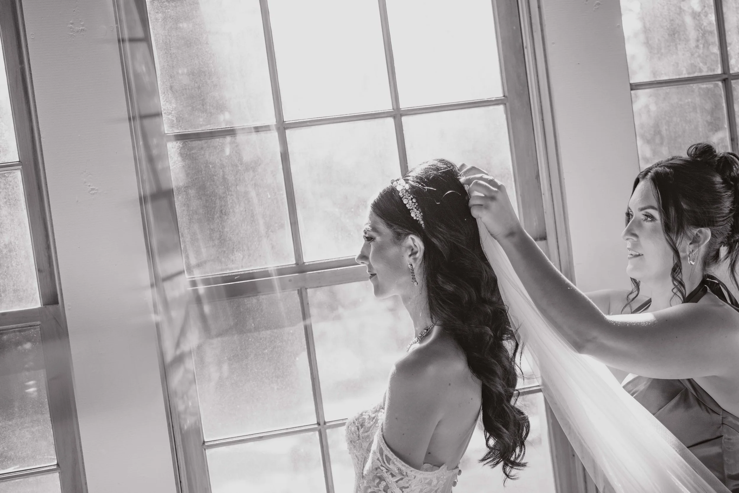
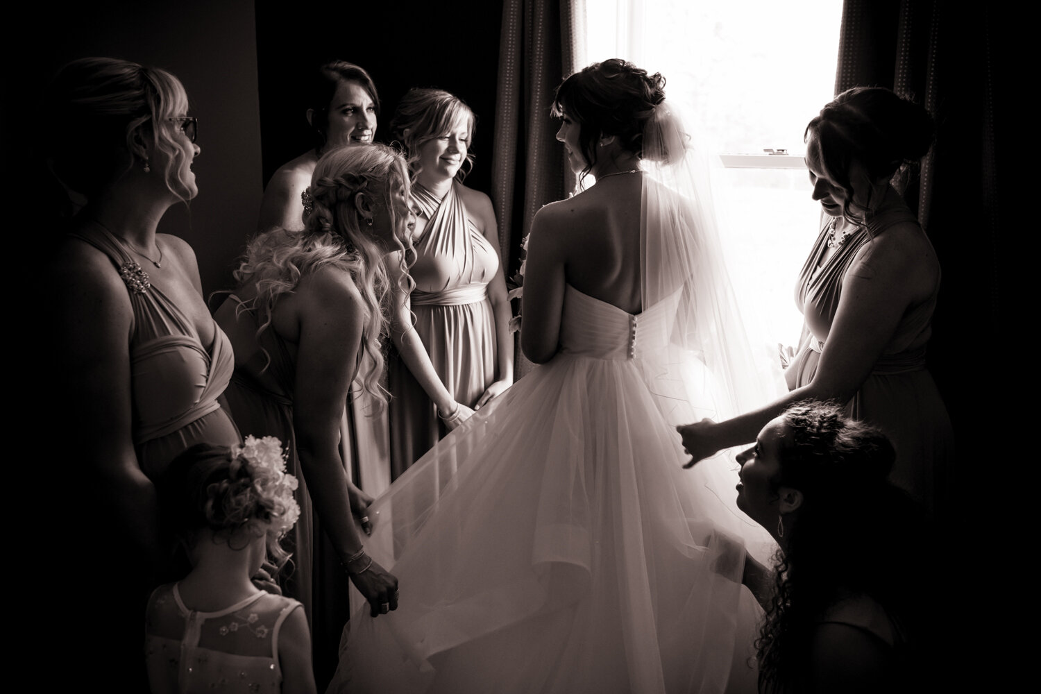
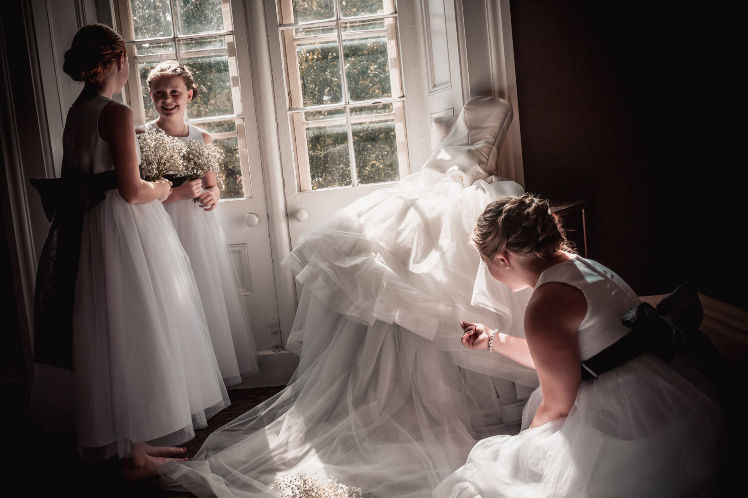
THE GOLDEN RATIO
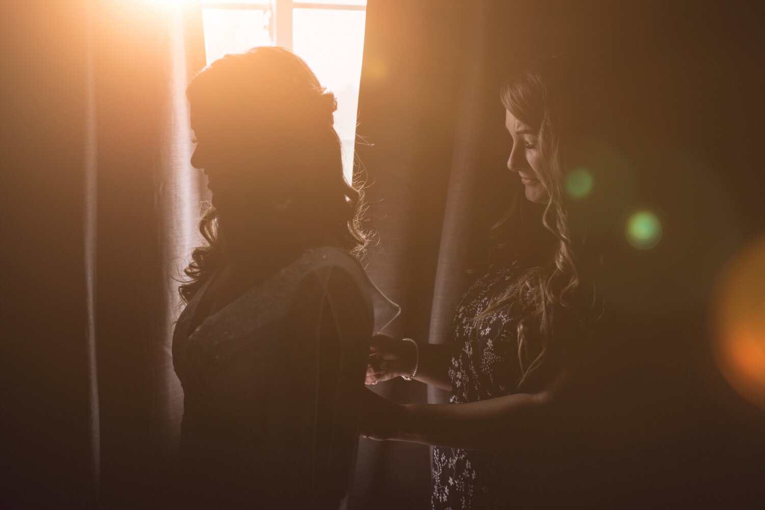
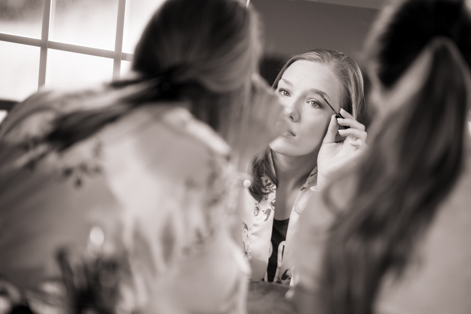
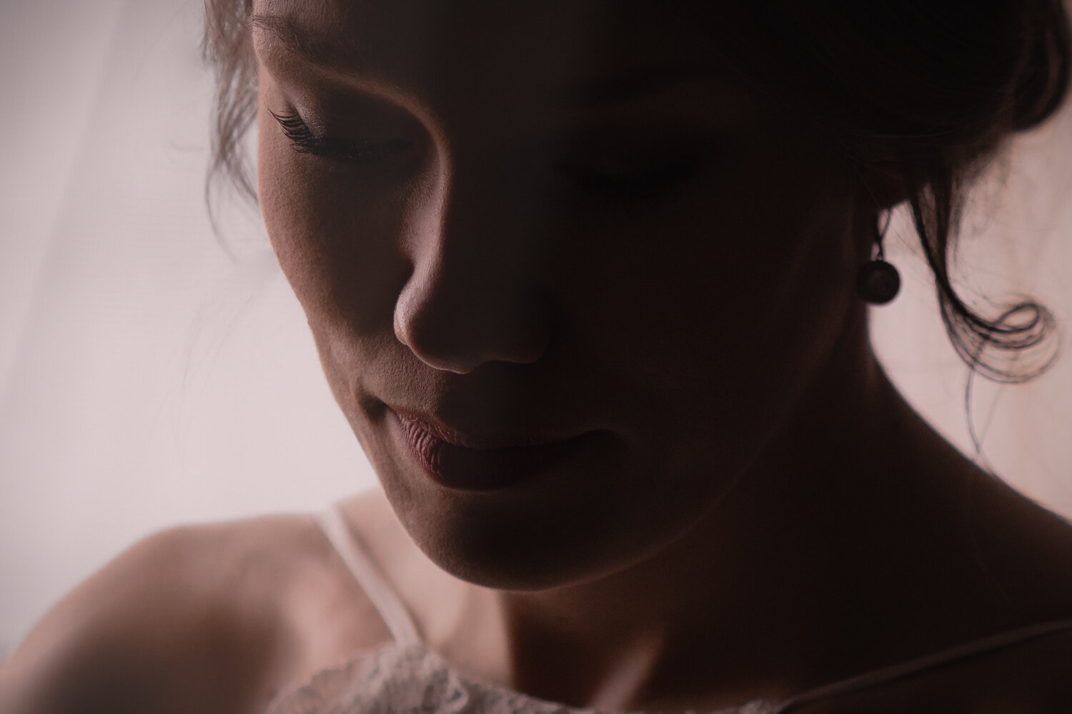
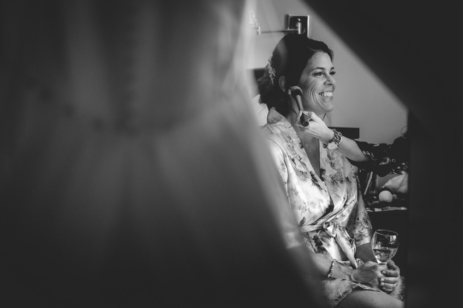
A bride on the morning of her wedding getting her makeup and hair done. The alignment of the Fibonacci sequence is such that her eye is aligned perfectly. One thing you might notice about this photo is how it breaks the rule of having your subjects facing the direction of the center of the frame.
In my mind the coolest of them all is the Fibonacci sequence visually represented, a.k.a., “the Golden Ratio.” It represents an exponential ratio which we see in nature with things like sea shells, pine cones, flower petals, even the bones of our hand! It’s a precise mathematical formula - F(n) = F(n-1) + F(n-2), which when visually represented would look like the white spiral overlaid on the image seen here.
See how the image doesn’t fully adhere to the Rule of Thirds, but her eye aligns perfectly with the Fibonacci sequence/Golden Ratio?
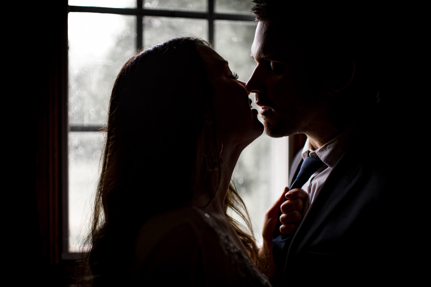
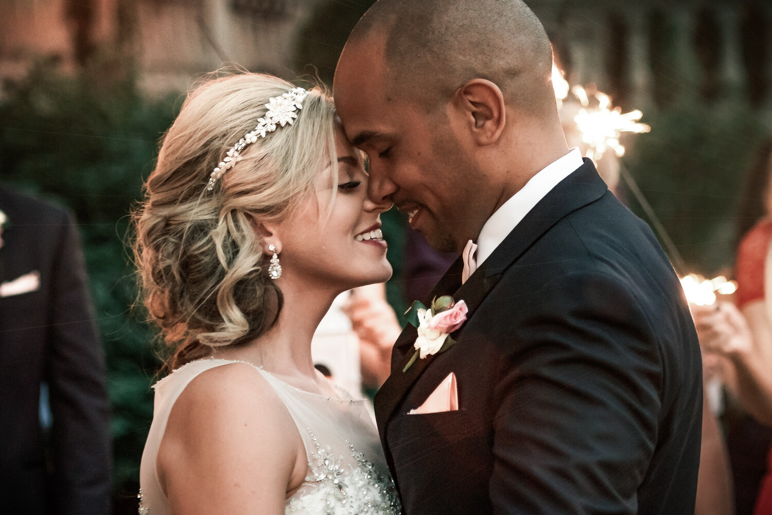
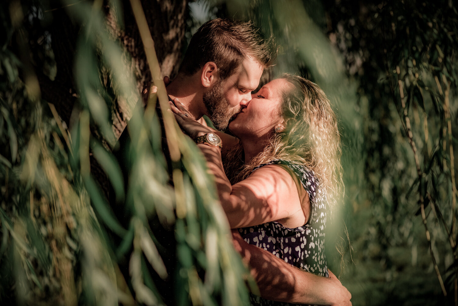
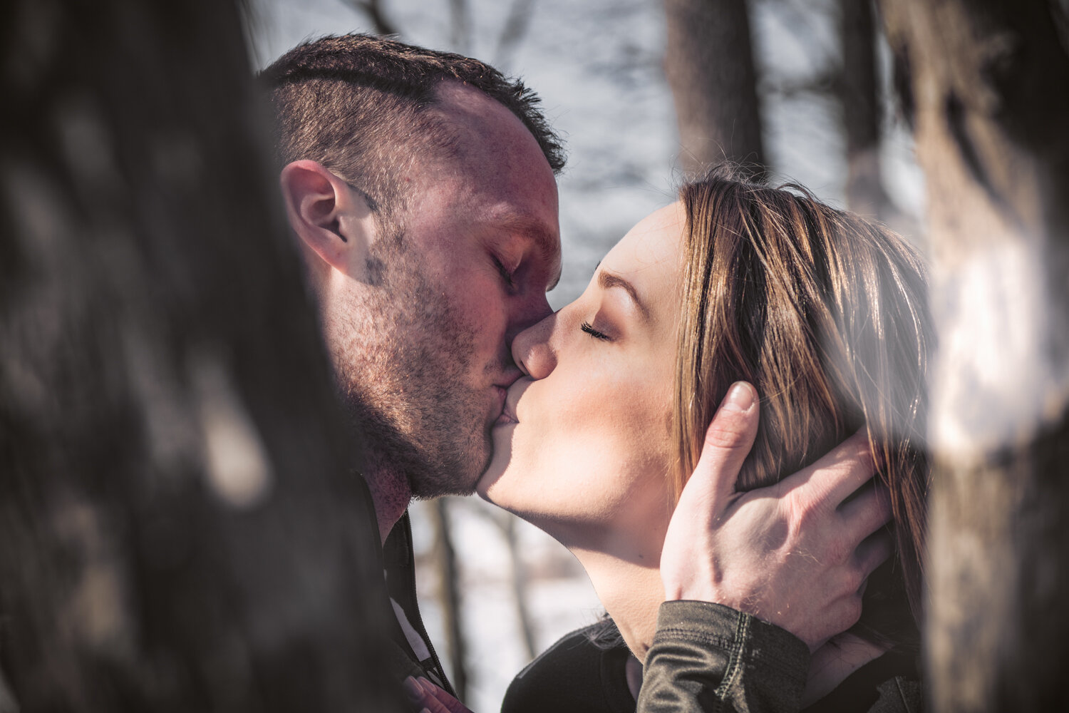
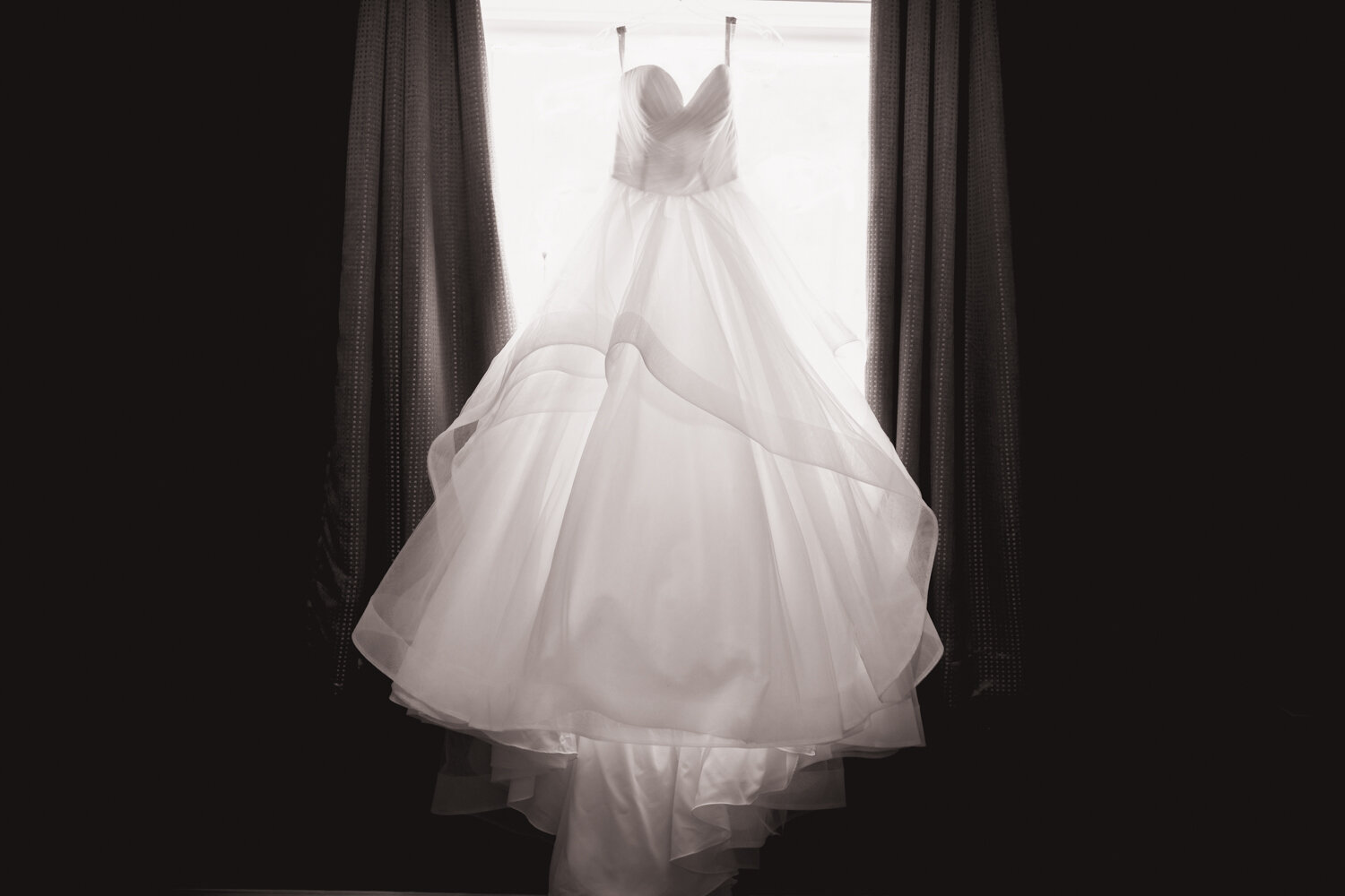
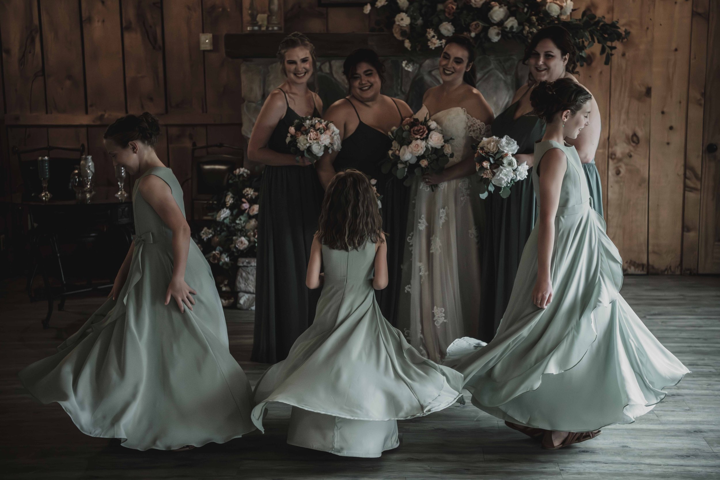
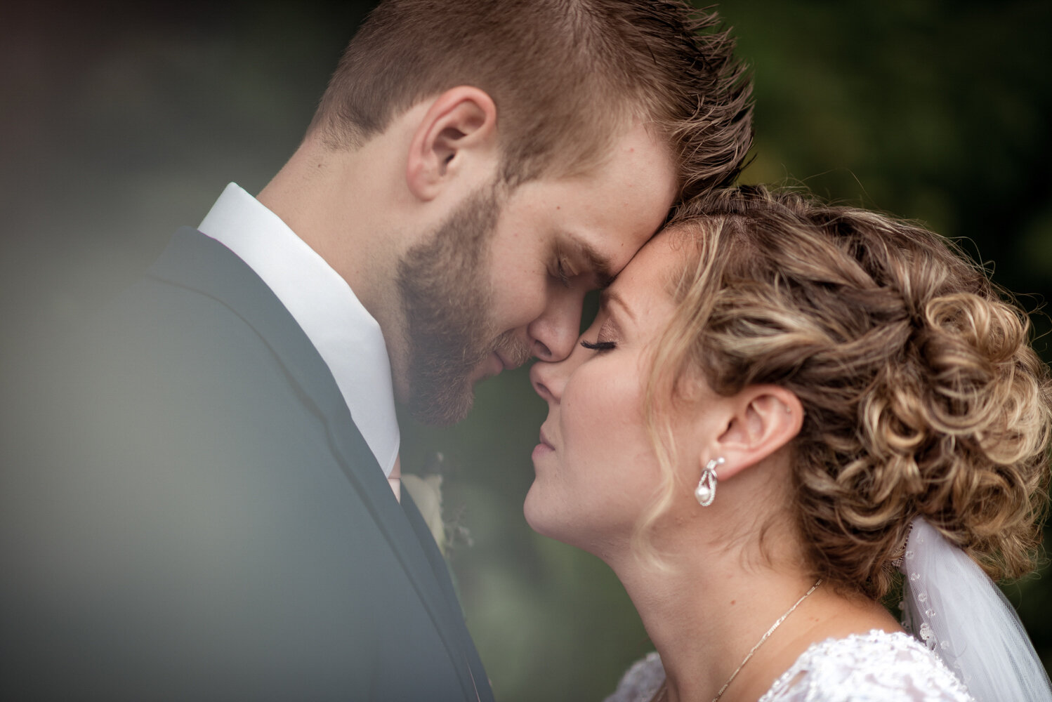
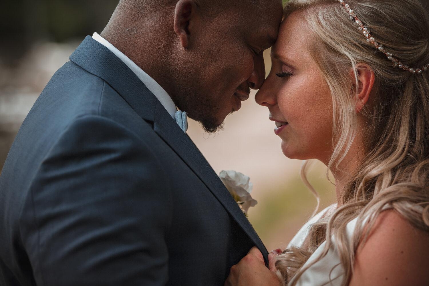
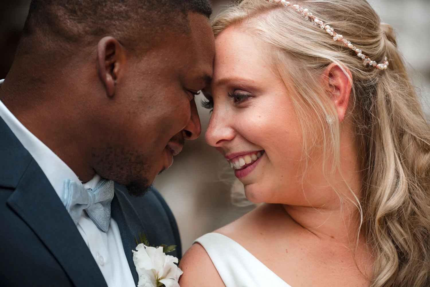
LET THERE BE LIGHT
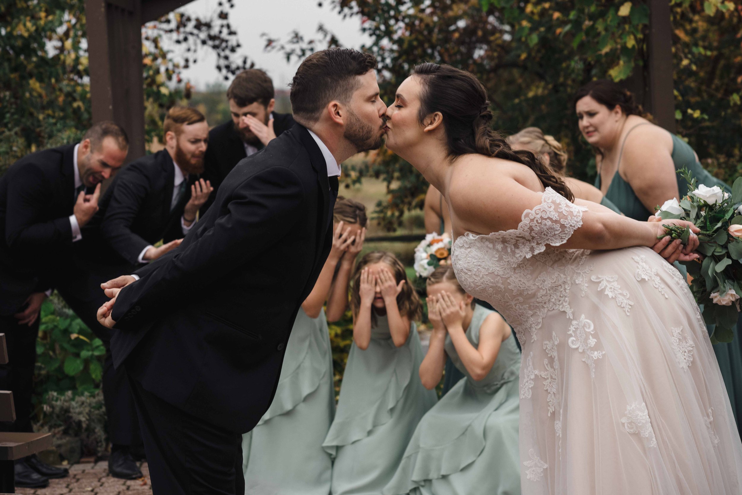
Light is a key component to photography. Without light we would be left with little more than a black image, no colour, no depth. Understanding how light functions and how we can take advantage of it with the tools, subjects and environments available to us is critical in achieving our photographic objectives. Some situations like studio photography are controlled and offer you extended time to capture the image, while others are more time-critical like the first kiss at a wedding. What matters most in ensuring that you see success with your imagery is knowing exactly how to control the light coming into your camera.
HOW DO WE CONTROL LIGHT?
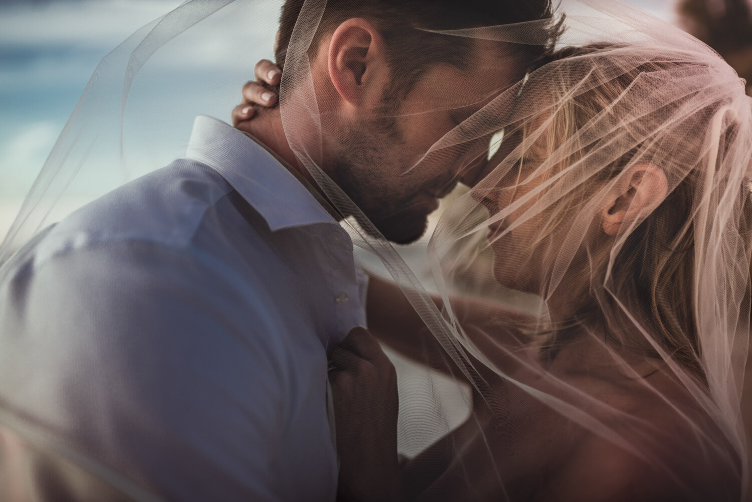
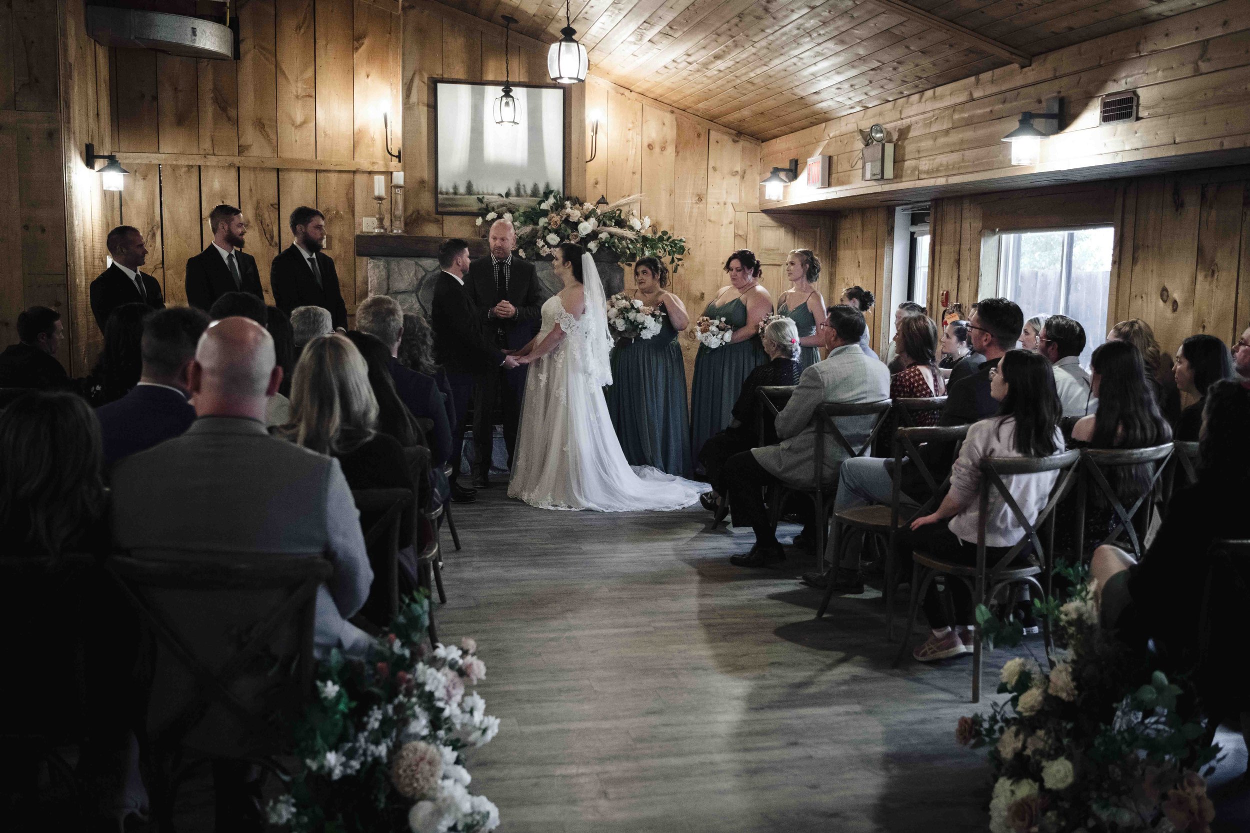
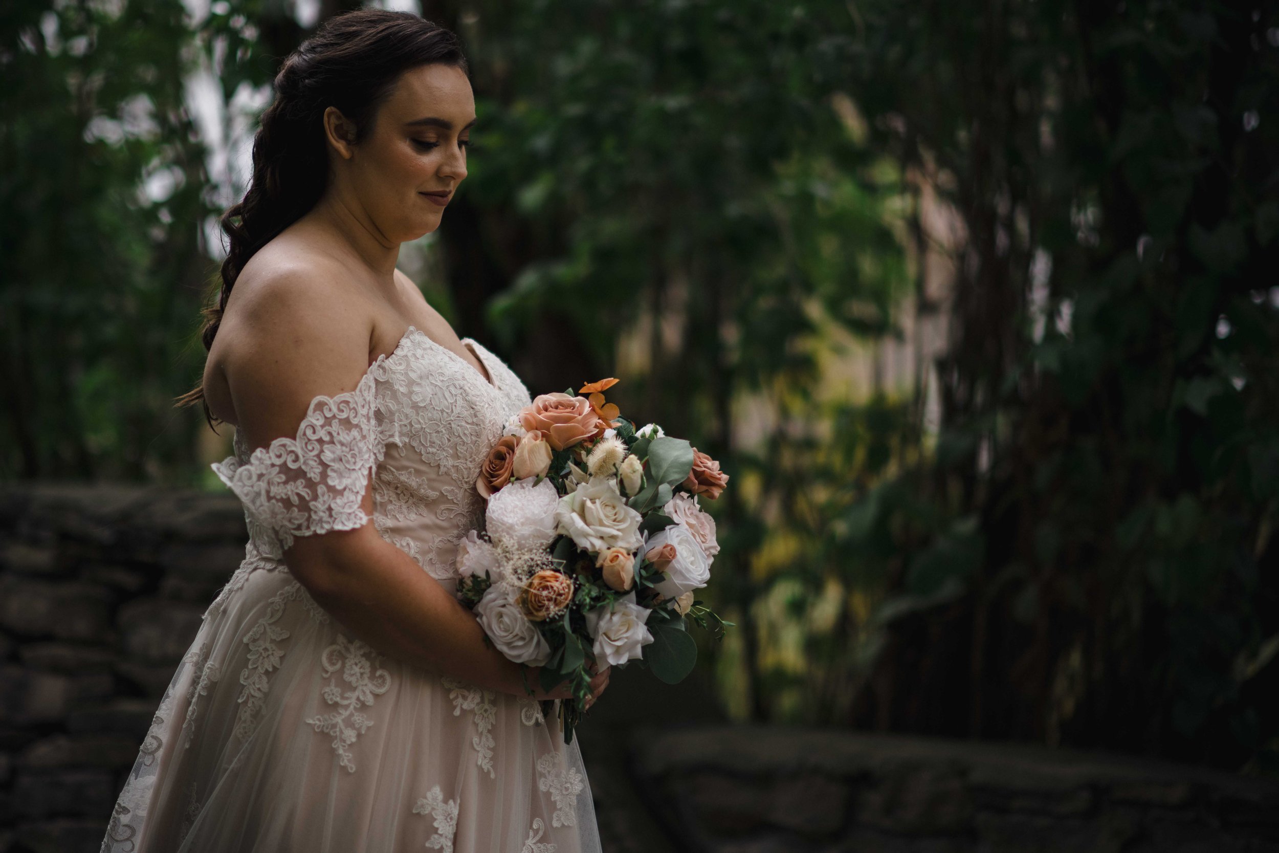
An image from a wedding I shot in The Farmhouse building of Strathmere.
When it comes to cameras we have a great many things to recognize before we answer that. Firstly, not all cameras are created equal. Some have mirrors with physical movement shooting onto film or a memory card, some are fully digital, some can change lenses to offer more options objectively or creatively-speaking, and some are themselves accessory features like in cell phones!
At the core of it however, cameras all tend to operate on the same core critical concepts, and the most important pertaining to light is that of Exposure. Images rely on light landing - even incredibly briefly, on a light-sensitive film or sensor. Exposure is a term that refers to the overall amount of light which lands on the exposed photo-sensitive film or sensor to capture an image and the resulting tonal range it creates; essentially in layman’s terms it refers to the brightness/darkness of the overall final image.
How Does our Camera Control Light?
The three elements of the exposure triangle. Through controlling these elements we establish critical details including not only the exposure, but the amount of the image in focus, if it has blur, and how much (if any) digital noise we see in the image.
We’re going to explore this with a common industry term called the “Exposure Triangle,” which refers to three specific elements of a camera and how they can be adjusted to have different impacts on an image’s final look/exposure. Here (briefly) is a surface-level overview of the theory behind how those elements work:
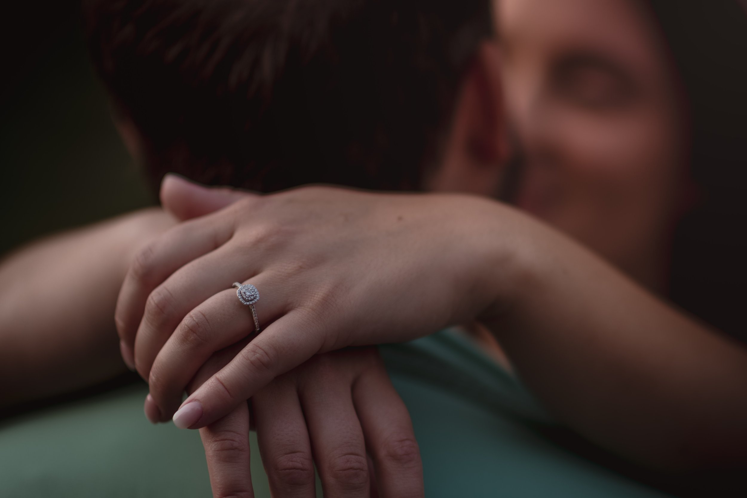
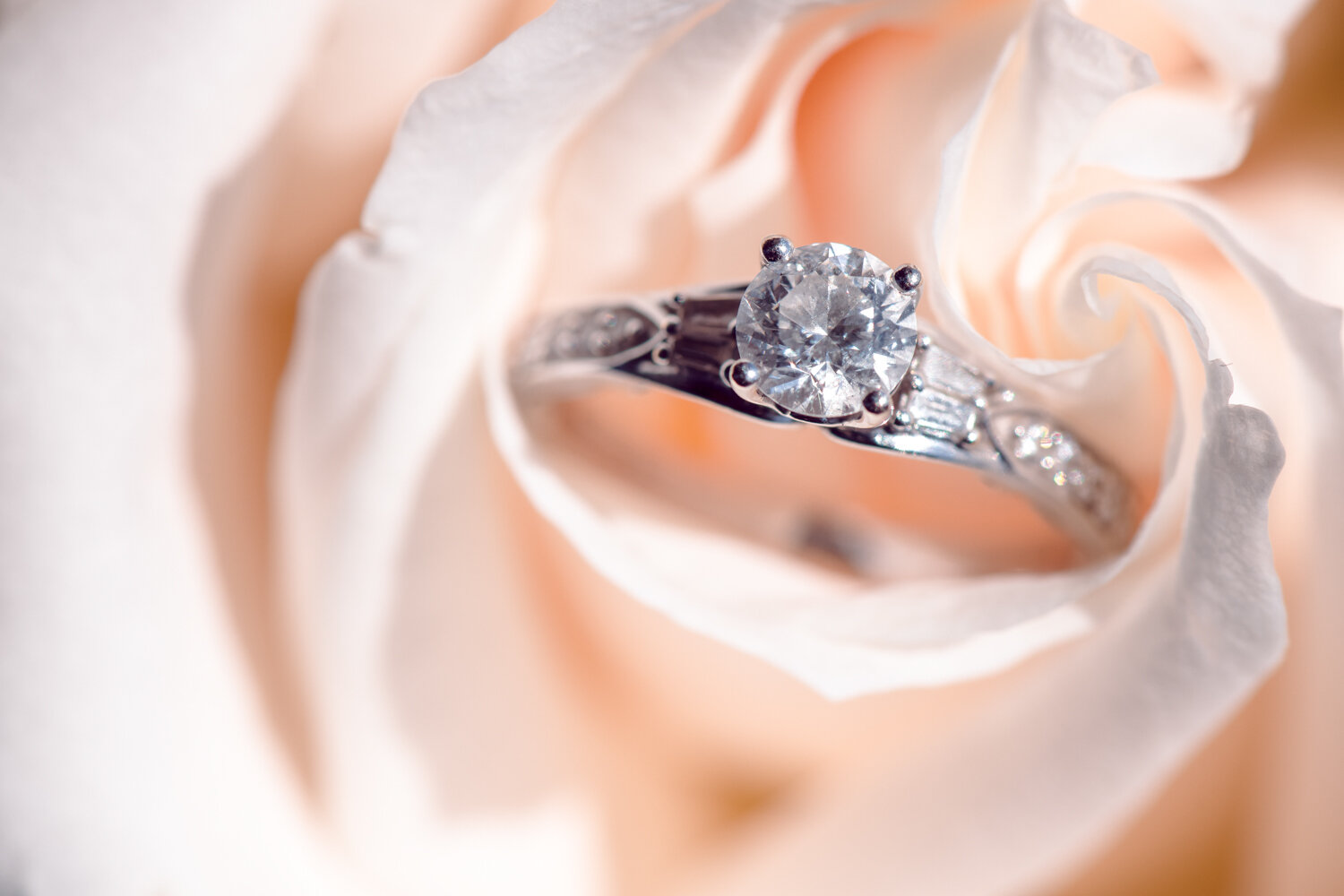
If you look closely, you’ll see that the face of the ring is in focus while the rose and background are progressively out of focus. That represents a shallow depth of field and is controlled by your camera’s aperture.
APERTURE
In a proper camera lens there are a series of little blades which expand and contract to allow light through, much like the iris of an eye. The amount of the image which is deemed ‘acceptably sharp’ is referred to as DEPTH OF FIELD and is a very important concept for you to know moving forward. When there are images with very little content which is super sharp, but large parts of the image are blurry, we refer to those as having a “shallow depth of field.” When much of it is sharp we refer to those images as having a “deep depth of field.”
An example of shutter speed not being effectively used to showcase motion blur.
2. SHUTTER SPEED
This refers to how long the sensor will be active (in modern digital cameras) or how long the mirror will be up and curtains exposing the film/sensor. This setting is also the one which determines if an image will freeze motion or show motion blur. There are instances where a person might need motion frozen - such as when a bride is walking down the aisle, and there are instances where motion blur makes a lot of sense - such as when you’re showing helicopter blades in motion, or a race car.
This setting is also the one which determines if an image will freeze motion or show motion blur. There are instances where a person might need motion frozen - such as when a bride is walking down the aisle, and there are instances where motion blur makes a lot of sense - such as when you’re showing helicopter blades in motion, or a race car.
An example of low light imagery where the ISO needed to be raised - creating noise.
3. ISO
This refers to the film/sensor’s responsiveness to light. While it might sound like it’s a catch-all which compensates for when the image exposure is too dark/bright because of the aperture or shutter speed settings, it does come with the unfortunate side effect of digital noise.
You may be asking “what is the threshold for acceptable ISO before the noise becomes distracting/unbearable?” There are really too many factors to say. It might be a matter of personal preference, sensor capacity, the subject matter in the image (low-light areas tend to showcase noise a lot), and the list goes on. Your best bet is always to shoot often and gain an understanding of what to expect and how to counter it if possible. Remember, noise isn’t the end of the world! An image with some noise is better than no image at all, and many successful photographers are known to use it artistically.
For a bit more in-depth an explanation of some of the techniques, feel free to watch the video below:
A video overview of some of the fundamental compositional rules to enable your photos to be more aesthetically pleasing.
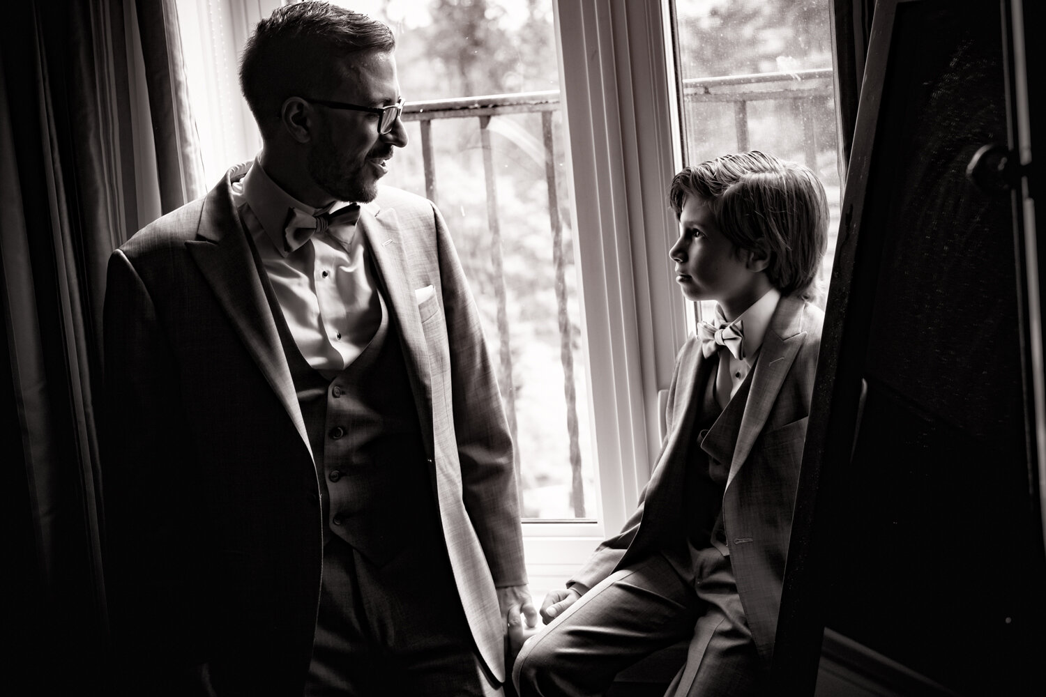
PERSPECTIVE
The angle and height of your camera are also incredibly important compositional considerations. How you direct the lens can send strong messages about the subject, and can also draw the viewer to connect/contemplate by doing things like showcasing a common subject from a completely unorthodox angle. Here are three of the most common and useful perspectives to explore:
Bird’s-Eye View
Bird’s-eye view refers to imagery taken on a downward angle, as if seen by a bird. It can be a creative new way of exploring a familiar environment, but it can also be used to imply weakness in the subject by making them smaller - as if the viewer is looking down upon the subject.
BUG’s-Eye View
Bug’s-eye view refers to imagery taken on an upward angle, as if seen by an insect. It also can be a creative new way of exploring a familiar environment, but it can be used to psychologically imply strength or power in the subject by making them larger - as if the viewer is looking up at the subject.
Eye LEVEL View
Eye level view refers to imagery taken on an angle representative of what a person would see it naturally.
Looking to understand it in application? Check out this link to an exposure triangle simulator!
Colour Balance and Colour Theory
We can’t start talking about colour without starting off by identifying it for what it is: light! In its simplest form it is light, something we explored previously, but in this particular lesson we’re going to explore how the different colours - light separated along the visible spectrum into its constituent wavelengths can be used most effectively by us as photographers. As photographers we should be developing an awareness for not only our situation and the elements of light in our environment, but we should be considering the colour of light.
A YouTube video explaining the spectrum of colour along the white balance scales we use in our cameras.
White Balance
Take a look around you, notice not just the strength of the lights of the room you’re in, but compare the hue of the lights one to another. Notice how the lightbulbs are different from the colour of the sun, different from the screens you use, and even (often) different from one another? That range of colour spectrum is referred to as the WHITE BALANCE. A white piece of paper might appear yellow or blue under a lightbulb with yellow (think Tungsten bulbs) or blue hue (think fluorescent bulbs), and as a result your camera tries to compensate by bringing the whole image towards a white balance which would correct the colour cast of the light source. When it works, the image will show white as white and all of the other relative tones as their actual hues; however, when it doesn’t nail the adjustment it can leave your image towards the yellow/warmer end of the spectrum, or the blue/cooler end. For a more in-depth understanding please check out this video.
FUNDAMENTAL COLOUR THEORY
In our regular classes colour theory is broken down into a minimum of two days with exercises to support the understanding. To keep it shorter, I’m just going to suggest that you visit the following link:
ADOBE COLOR

Adobe Color is an online resource which (among other things) can enable you to understand the relationship of complimentary colours. These relationships are referred to as Colour Harmonies, and for more information feel free to refer to this other resource on Colour Theory. There are a number of rules which sum up the harmony rules, and they are as follows:
Monochromatic harmonies - Single hues with a variety of tones and tints to compliment one another.
Complementary colours - Here we take two hues which are on opposite sides of the colour wheel
Split-complementary colours - Similar to Complementary Colours where you take the colour directly opposite, this harmony involves identifying the complement, then using the hues, tints and shades of the two hues directly adjacent the complementary colour as a three colour harmony.
Double-split Complementary Colours - Here you take two hues which are adjacent and pair them with their counterpart complementary colours.
Triadic Harmonies - With triadic harmonies, imagine that we’ve taken the colour wheel and divided it equally into thirds.
Tetradic Colours - These are equally spaced around the colour circle as if to create a square of colours or to reflect a cross.
Analogous colors - This is when you collectively use a number of colours which are adjacent on one side of the colour wheel
WHY DO WE NEED TO CONCERN OURSELVES WITH COLOUR THEORY?
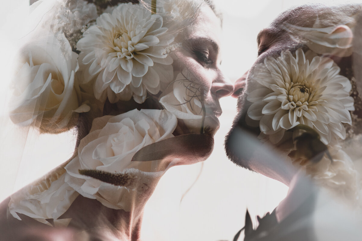
A double exposure shot from an Ottawa wedding I shot a short while back.
Just like a specific musical cord or note at the right time can inspire an emotional impact, the right colour can trigger a psychological response. We’ve been exposed to so many of the colours consistently in the same or similar contexts, so it becomes ingrained in our minds that certain colours imply certain emotional connections. Let’s briefly explore other known common ties people make between colours and psychological/emotional responses. Here are a few:
Green is frequently a sign of life, health, and freshness. It can reflect youth, the implied motions of growth and literal motions called upon when we see green in a traffic light priming us to move forward. It’s known for its tie to nature, natural things (as opposed to man-made things like technology). Conversely, it can also signify greed, and other sinister qualities (think house Slytherin). Frequently older movies depicted poisons and villains using prominent green elements.
Blue is often used to denote things like faithfulness, reliability, solitude, labour, peace, distance, volume (space and bodies of water), tranquility, isolation, despair, among other things. When considering blue one might consider that traditionally it has strong associations with masculinity and tradespeople - the blue-collar workers.
Orange is a fun and funny colour - literally. We associate it with fun, clowns, fairs, fruits, joy, life, activity, strength. Because we see it with the season of fall so prominently and also sunsets and sunrises, we also see it as an association to change. One other association we have with orange is that of danger or hazzard, as it draws the eye (think of how you see it prominently in construction markers, buoys, hazard signs, vests, etc.)
Brown is often associated with the earth, warmth, chocolate, simplicity, trees, agriculture, neutrality, fairness, and peace.
Key Terms
Primary Colours - In the light spectrum the primary colours are Red, Green and Blue. Through combination of these you can create all of the other colours we see in light.
Secondary Colours - There are three secondary colours in the additive space, Cyan, Magenta, and Yellow. It should be noted though that Magenta is a curious one to consider…
Tertiary (also called “indeterminate”) Colours - These are mixed colours, ones comprised of Primary and/or Secondary Colours, where the original contributing colours are no longer obviously dominant; Blue-green, red-orange, yellow-green, these are all good examples of tertiary o “indeterminate” colours.
Hue - This refers to the original colour as we would see it in its purest form (undiluted in any way - neither lighter, duller, nor darker. That colour can be Primary, Secondary, or Tertiary, meaning it might be Red, Yellow, Cyan, Magenta, Yellow-Green, or Red-Violet.
Tint - Tint refers to when we add white to a hue making it lighter in shade. The light reds, pinks, etc., and everything along the pastel range of colours are representative of adding white to a hue - or “tinting” it.
Shade - Shade refers conversely to when we add black to a hue making it darker. The crimson reds, midnight blues (the true colour tone #191970), these reflect shades of a hue - darker than the pure hue itself.
Tone/Saturation - Tone refers to the process of washing a hue out by adding grey. This one does not directly tie to the light spectrum as tidily as the others when it comes to photography, as one cannot simply “add a grey light…” however, I introduce the traditionally art-aligned colour theory term to give a foundation for further discussion. It will be something we explore in post-processing, as increasing the saturation in select elements/images/regions of an image can be an effective means by which to draw a viewer’s eye. Psychologically-speaking, colourful imagery tends to be perceived as more playful, whereas desaturated imagery is more serious. In effect, the more one desaturates, the higher the requirement for a strong focus on content, as there is less colour to draw the viewer.
Luminosity - This (in photographic contexts) refers to the range of white (tint) and black (shade) added to colour. As it pertains to hues, each individual hue has an inherent luminosity value, meaning that one will often appear to be lighter than another. A true yellow would likely be lighter than a true red, which would imply that a shift in hue would also equate to a shift in luminosity. To be clear however, any shift (tint or shade) along the luminosity of a hue will reflect a desaturation of the hue. You cannot add white nor black without moving away saturation-wise from the purest hue.
Conclusion
These points and concepts aren’t meant to be everything you need to master the applied study or theories of photography, so please come to these with an attitude of ever ongoing and continuous development. Though I myself have studied, applied, and adapted these rules personally, there are many which I only use occasionally, and others which I outright ignore. Please use these to gain a mastery of the fundamentals, but beyond that phase, when you start to really grow, please consider stepping outside of them from time to time. If you have any questions, kindly review the material or reach out! Be safe, make good decisions, and keep shooting!