

Subject: Photography
Objective: Students should have a grasp of the fundamentals of colour theory as it pertains to the realm of photography, how they can recognize it, use it, and control/counter it when necessary. Though much of this will be applicable to later lessons in the retouching unit, this particular lesson will not focus on work done in post. There is much to explore in this material, and it should be done across 2-3 lessons at a minimum with 2-3 activities including things like identifying the harmonies and applying the concepts to ensure it is adequately taught.
Intro to Colour Theory for Photographers
Intro
Colours, their hue, tint/shade and the impacts they have on the viewer can have a pronounced psychological effect. Understanding the impact of colour relative to your image’s content and composition can be of tremendous value. At a very minimum it’s not something you want to be callous about and overlook.
We can’t start talking about colour without starting off by identifying it for what it is: light! In its simplest form it is light, something we explored previously, but in this particular lesson we’re going to explore how the different colours - light separated along the visible spectrum into its constituent wavelengths can be used most effectively by us as photographers.
KEY TERMS
There are a number of key terms we should get right out of the way from the beginning, as I want to be clear that each one is specific, and we should know the differences between them moving forward. Also, for those of you who are going to be REALLY technical and focus in, I should note that I’m going to be focused on an Additive Colour rather than a Subtractive Colour approach to my theory for this as we will be assuming direct cast from origin for this, and dealing with reflections in the later lessons with the family of angles (where the subtractive would make more sense to consider). Here we go!
Primary Colours - In the light spectrum the primary colours are Red, Green and Blue. Through combination of these you can create all of the other colours we see in light.
Secondary Colours - There are three secondary colours in the additive space, Cyan, Magenta, and Yellow. It should be noted though that Magenta is a curious one to consider…
Tertiary (also called “indeterminate”) Colours - These are mixed colours, ones comprised of Primary and/or Secondary Colours, where the original contributing colours are no longer obviously dominant; Blue-green, red-orange, yellow-green, these are all good examples of tertiary o “indeterminate” colours.
Hue - This refers to the original colour as we would see it in its purest form (undiluted in any way - neither lighter, duller, nor darker. That colour can be Primary, Secondary, or Tertiary, meaning it might be Red, Yellow, Cyan, Magenta, Yellow-Green, or Red-Violet.
Tint - Tint refers to when we add white to a hue making it lighter in shade. The light reds, pinks, etc., and everything along the pastel range of colours are representative of adding white to a hue - or “tinting” it.
Shade - Shade refers conversely to when we add black to a hue making it darker. The crimson reds, midnight blues (the true colour tone #191970), these reflect shades of a hue - darker than the pure hue itself.
Tone/Saturation - Tone refers to the process of washing a hue out by adding grey. This one does not directly tie to the light spectrum as tidily as the others when it comes to photography, as one cannot simply “add a grey light…” however, I introduce the traditionally art-aligned colour theory term to give a foundation for further discussion. It will be something we explore in post-processing, as increasing the saturation in select elements/images/regions of an image can be an effective means by which to draw a viewer’s eye. Psychologically-speaking, colourful imagery tends to be perceived as more playful, whereas desaturated imagery is more serious. In effect, the more one desaturates, the higher the requirement for a strong focus on content, as there is less colour to draw the viewer.
Luminosity - This (in photographic contexts) refers to the range of white (tint) and black (shade) added to colour. As it pertains to hues, each individual hue has an inherent luminosity value, meaning that one will often appear to be lighter than another. A true yellow would likely be lighter than a true red, which would imply that a shift in hue would also equate to a shift in luminosity. To be clear however, any shift (tint or shade) along the luminosity of a hue will reflect a desaturation of the hue. You cannot add white nor black without moving away saturation-wise from the purest hue.
White Balance Revisited
We discussed white balance in the previous lesson and did so much more in-depth with a focus on the history and theory. Here’s a video for those of you who would like to recap the photography-applicable elements without all the reading.
A video to help students recap on the white balance (kelvin) lesson we had previously.
Known Emotional Reactions
As photographers we should be developing an awareness for not only our situation and the elements of light in our environment, but we should be considering the colour of light. We have already touched upon one in the Music of Colour section (red), but let’s briefly explore other known common ties people make between colours and psychological/emotional responses. Here are a few:
Green is frequently a sign of life, health, and freshness. It can reflect youth, the implied motions of growth and literal motions called upon when we see green in a traffic light priming us to move forward. It’s known for its tie to nature, natural things (as opposed to man-made things like technology). Conversely, it can also signify greed, and other sinister qualities (think house Slytherin). Frequently older movies depicted poisons and villains using prominent green elements.
Blue is often used to denote things like faithfulness, reliability, solitude, labour, peace, distance, volume (space and bodies of water), tranquility, isolation, despair, among other things. When considering blue one might consider that traditionally it has strong associations with masculinity and tradespeople - the blue-collar workers.
Orange is a fun and funny colour - literally. We associate it with fun, clowns, fairs, fruits, joy, life, activity, strength. Because we see it with the season of fall so prominently and also sunsets and sunrises, we also see it as an association to change. One other association we have with orange is that of danger or hazzard, as it draws the eye (think of how you see it prominently in construction markers, buoys, hazard signs, vests, etc.)
Brown is often associated with the earth, warmth, chocolate, simplicity, trees, agriculture, neutrality, fairness, and peace.
Red is known for being the most psychologically impactful colour. It is tied to passion, love, power, anger and many more very dramatic associations. We see it with our stop signs and lights, priming us to stop or take notice of something strong, dangerous, or important. Its links to aggression and dominance are exploited to infer power. Being the colour of blood, we see it tied to life in many instances (an interesting contrast to green - its complementary colour), and it’s supported when we look at the Geneva Convention protected medical symbols of the Red Cross, Red Crescent and Red Crystal.
Yellow is a colour tied to energy, warmth, and attention, but it’s also tied to caution, optimism, conclusions (sunsets), and cheer.
The Music of Colour
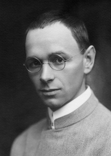
Interested in more of the theory behind the art of colour and how I learned much of this? Try reading this fella’s work. This is Johannes Itten, his book The Art of Color is phenomenal. (Image Source: https://www.mycast.io/stories/bauhaus/roles/johannes-itten/967849)
It might be easier for some of you to consider colour as if it were music. Colours carry psychological impacts, they elicit emotion from viewers and lead us to feel or perceive different messages depending on what we see. A picture of something very red can lead us to conjure up ideas of love, passion, or even rage and anger. It’s no surprise that when Bugs Bunny riles up Elmer Fudd or taunts a bull, their eyes and heads grow vibrantly red. At the same time, mixtures of colours can send messages too: a beautiful red, yellow and orange might conjure the ideas of a sunset, or romance. We tend to associate humanity and life with the warmer and more vibrant colours. Red on its own however will not have the same impacts on use as it will when complimented by orange and yellow. It’s as if you’re listening to music, it’s very different to hear a single note vs a chord.
In music if you take a scale (think Do-Re-Mi-Fa-So…) and put the 1st note, the 3rd, and the 5th together, you have a major chord. In the C Scale that would be C-E-G, the notes which make the C chord. Technically all of the notes can work together if played right, but those particular three make a very light and cheerful chord. However, there are other ways of shifting notes to make what is called a minor or more “sad” sounding chord, for instance if you shifted the E note to one half-step down it is now C-Eb-G and it’s a C Minor chord - a sadder chord. The same things can happen with colour!
The “Scales” in colour are called “Colour Harmony Rules” and they are single points relative to one another which work just like music notes do in a scale. For instance you might look at a rule such as Double Split Complementary, a rule which features four colours which work with one another, and you could change the three you choose to create an entirely different mood where the colours all still harmonize!
Try it out at the following link:
ADOBE COLOR

Adobe Color, a Fantastic tool for understanding Colour Theory.
Some of the other harmony rules are as follows:
Monochromatic harmonies - Single hues with a variety of tones and tints to compliment one another.
Complementary colours - Here we take two hues which are on opposite sides of the colour wheel and use the tints and tones of both colours to work favourably with one another (It took all I had not to make a “compliment” dad joke in the complement section).
Split-complementary colours - Similar to Complementary Colours where you take the colour directly opposite, this harmony involves identifying the complement, then using the hues, tints and shades of the two hues directly adjacent the complementary colour as a three colour harmony.
Double-split Complementary Colours - Here you take two hues which are adjacent and pair them with their counterpart complementary colours.
Triadic Harmonies - With triadic harmonies, imagine that we’ve taken the colour wheel and divided it equally into thirds. Those hues, tints and shades are used to employ the triadic approach. The primary (Red, Green, Blue) and secondary (Cyan, Magenta, Yellow) when viewed as pairings are examples of perfect triadic harmonies.
Tetradic Colours - These are pairings which are equidistant or equally spaced around the colour circle as if to create a square of colours or to reflect a cross when including the tints and shades. Because they’re equidistant they become paired with colours on opposite sides and thus become two sets of complementary colours.
Analogous colors - This is when you take a number of colours which are adjacent on one side of the colour wheel and use them collectively as a harmony.